library(ggplot2)
ggplot(data = mtcars, aes(x = factor(cyl), y = mpg))
A bar graph is a visualization used to display and compare the frequency, count, or other measure (e.g., mean) for different discrete categories or groups. Properties include:
Types include:
# Basic graph with added scale layer
ggplot(data = mtcars, aes(x = factor(cyl), y = mpg,fill = factor(cyl))) +
  geom_bar(stat = "summary", fun = "mean") +
  scale_x_discrete(name = "Number of Cylinders") +  # Customizing the x-axis
  scale_y_continuous(name = "Average Miles per Gallon",limits = c(0, max(mtcars$mpg) + 5), breaks = seq(0, 35, 5))  # Customizing the y-axis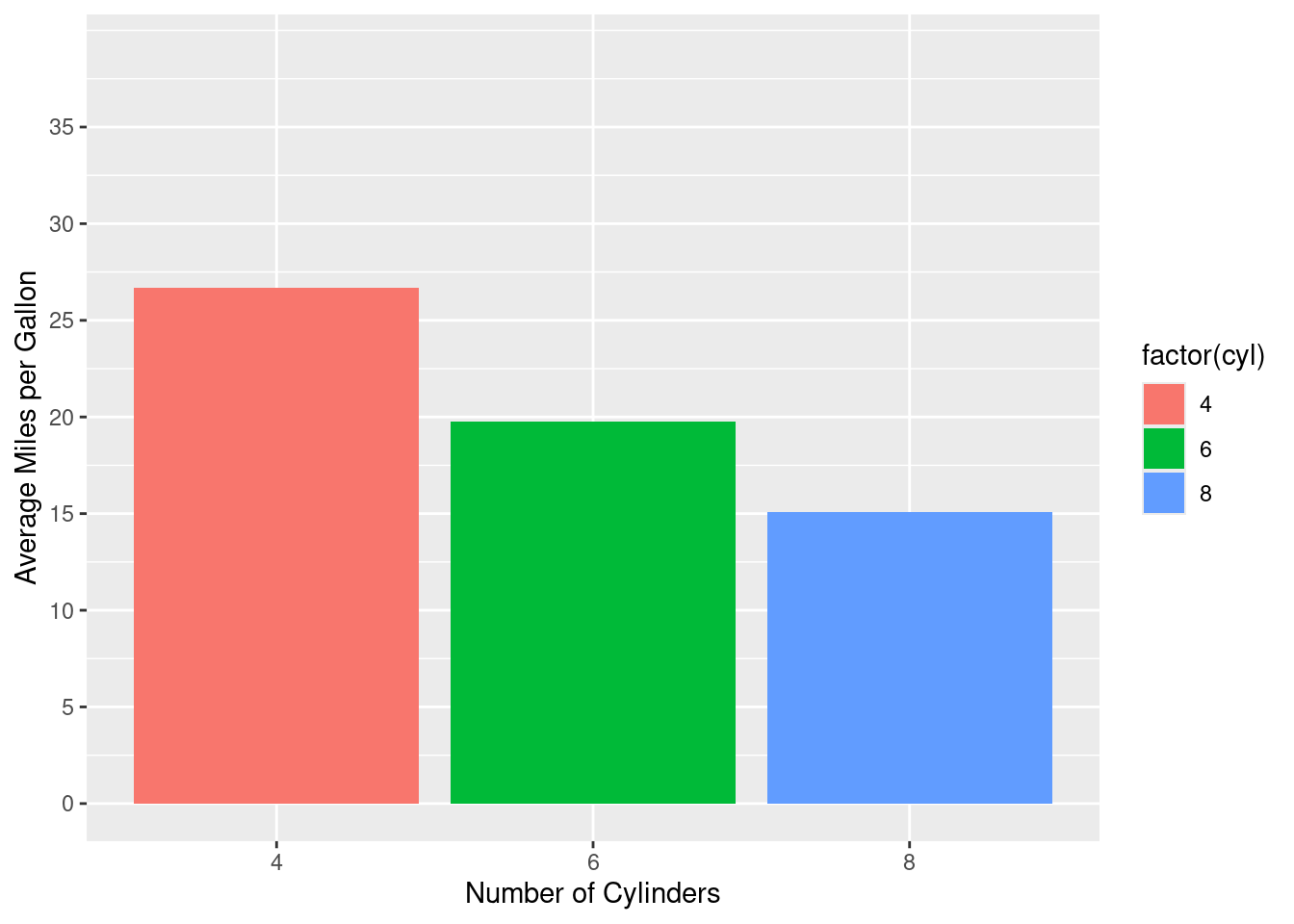
# Basic graph with added scale layer
ggplot(data = mtcars, aes(x = factor(cyl), y = mpg,fill = factor(cyl))) +
  geom_bar(stat = "summary", fun = "mean") +
  scale_x_discrete(name = "Number of Cylinders") +  # Customizing the x-axis
  scale_y_continuous(name = "Average Miles per Gallon",limits = c(0, max(mtcars$mpg) + 5), breaks = seq(0, 35, 5))+  # Customizing the y-axis
  coord_cartesian(xlim = c(1, 3), ylim = c(0, 35))  # Adjust based on your data's range or focus area\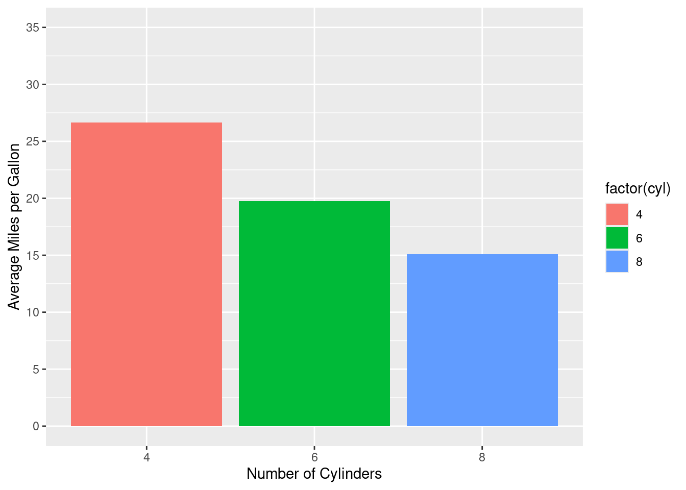
ggplot(data = mtcars, aes(x = factor(cyl), y = mpg,fill = factor(cyl))) +
  geom_bar(stat = "summary", fun = "mean") +
  scale_x_discrete(name = "Number of Cylinders") +  # Customizing the x-axis
  scale_y_continuous(name = "Average Miles per Gallon",limits = c(0, max(mtcars$mpg) + 5), breaks = seq(0, 35, 5)) + # Customizing the y-axis
  coord_cartesian(xlim = c(1, 3), ylim = c(0, 35)) + # Adjust based on your data's range or focus area\
  facet_wrap(~gear)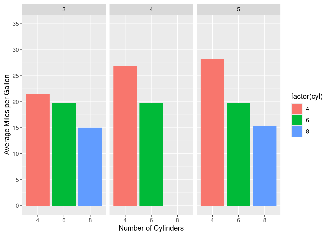
ggplot(data = mtcars, aes(x = factor(cyl), y = mpg,fill = factor(cyl))) +
  geom_bar(stat = "summary", fun = "mean") +
  scale_x_discrete(name = "Number of Cylinders") +  # Customizing the x-axis
  scale_y_continuous(name = "Average Miles per Gallon",limits = c(0, max(mtcars$mpg) + 5), breaks = seq(0, 35, 5)) + # Customizing the y-axis
  coord_cartesian(xlim = c(1, 3), ylim = c(0, 35)) + # Adjust based on your data's range or focus area\
  facet_wrap(~gear)+
  theme_light()+
  theme(plot.title = element_text(hjust = 0.5),  # Center the plot title
        axis.title.x = element_text(face = "bold", color = "blue"),  # Customize x-axis title
        axis.title.y = element_text(face = "bold", color = "blue"),  # Customize y-axis title
        strip.background = element_rect(fill = "lightblue"),  # Change facet label background
        strip.text = element_text(face = "bold", color = "navy"))  # Change facet label text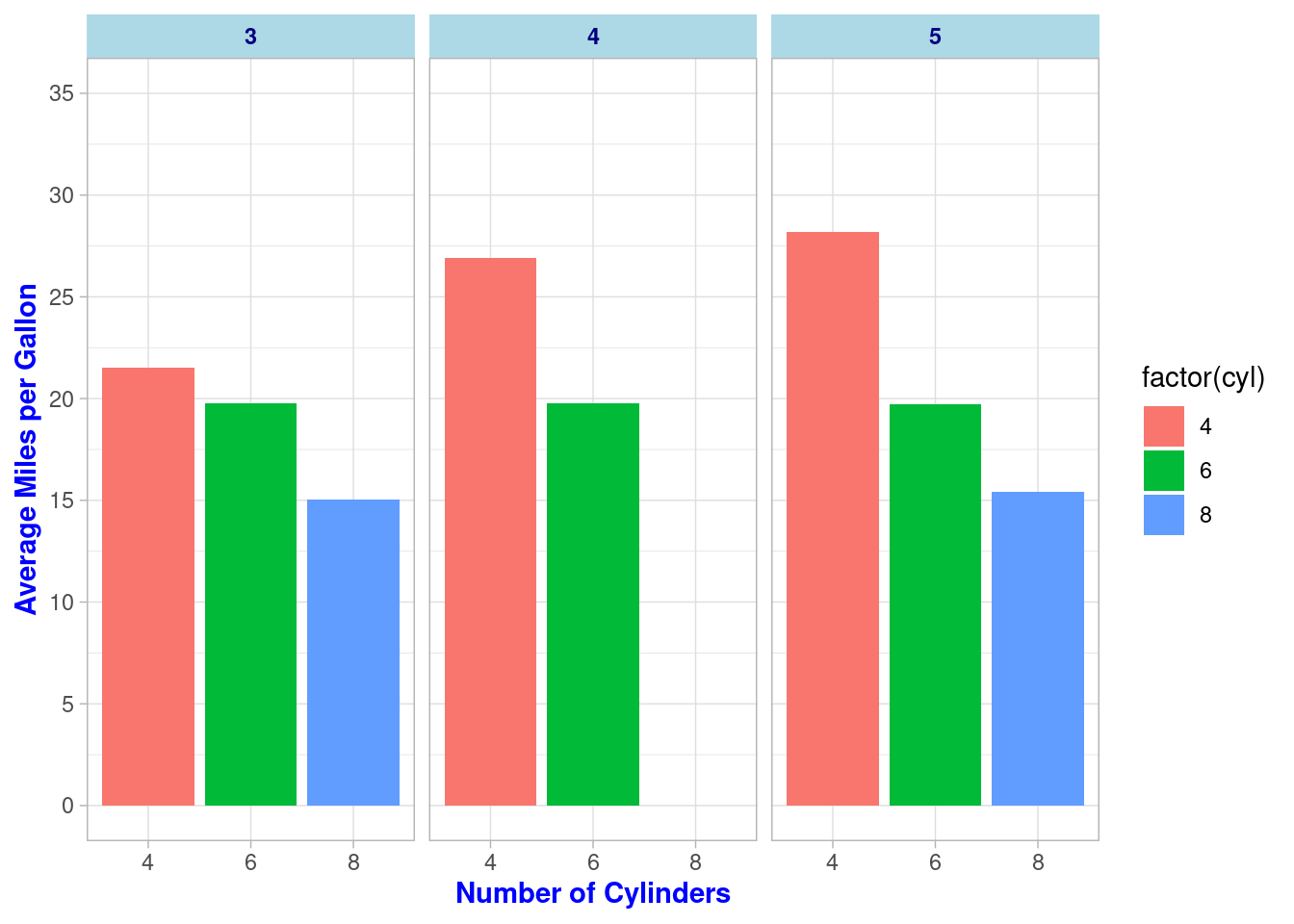
ggplot(data = mtcars, aes(x = factor(cyl), y = mpg, fill = factor(cyl))) +
  geom_bar(stat = "summary", fun = "mean") +
  scale_x_discrete(name = "Number of Cylinders") +  # Customizing the x-axis
  scale_y_continuous(name = "Average Miles per Gallon",limits = c(0, max(mtcars$mpg) + 5), breaks = seq(0, 35, 5)) + # Customizing the y-axis
  scale_fill_manual(values = c("lightcoral", "lightgreen", "lightblue"), name = "Cylinder Count") +
  coord_cartesian(xlim = c(1, 3), ylim = c(0, 35)) + # Adjust based on your data's range or focus area\
  facet_wrap(~gear)+
  theme_light()+
  theme(plot.title = element_text(hjust = 0.5),  # Center the plot title
        axis.title.x = element_text(face = "bold", color = "blue"),  # Customize x-axis title
        axis.title.y = element_text(face = "bold", color = "blue"),  # Customize y-axis title
        strip.background = element_rect(fill = "lightblue"),  # Change facet label background
        strip.text = element_text(face = "bold", color = "navy"))+  # Change facet label text
  labs(
    title = "Analysis of Car Mileage",  # Main title
    subtitle = "Grouped by Number of Cylinders and Gears",  # Subtitle
    caption = "Data source: mtcars dataset",  # Caption
    #x = "Number of Cylinders",  # x-axis label  #Already given above.
    #y = "Average Miles per Gallon",  # y-axis label   #Already given above.
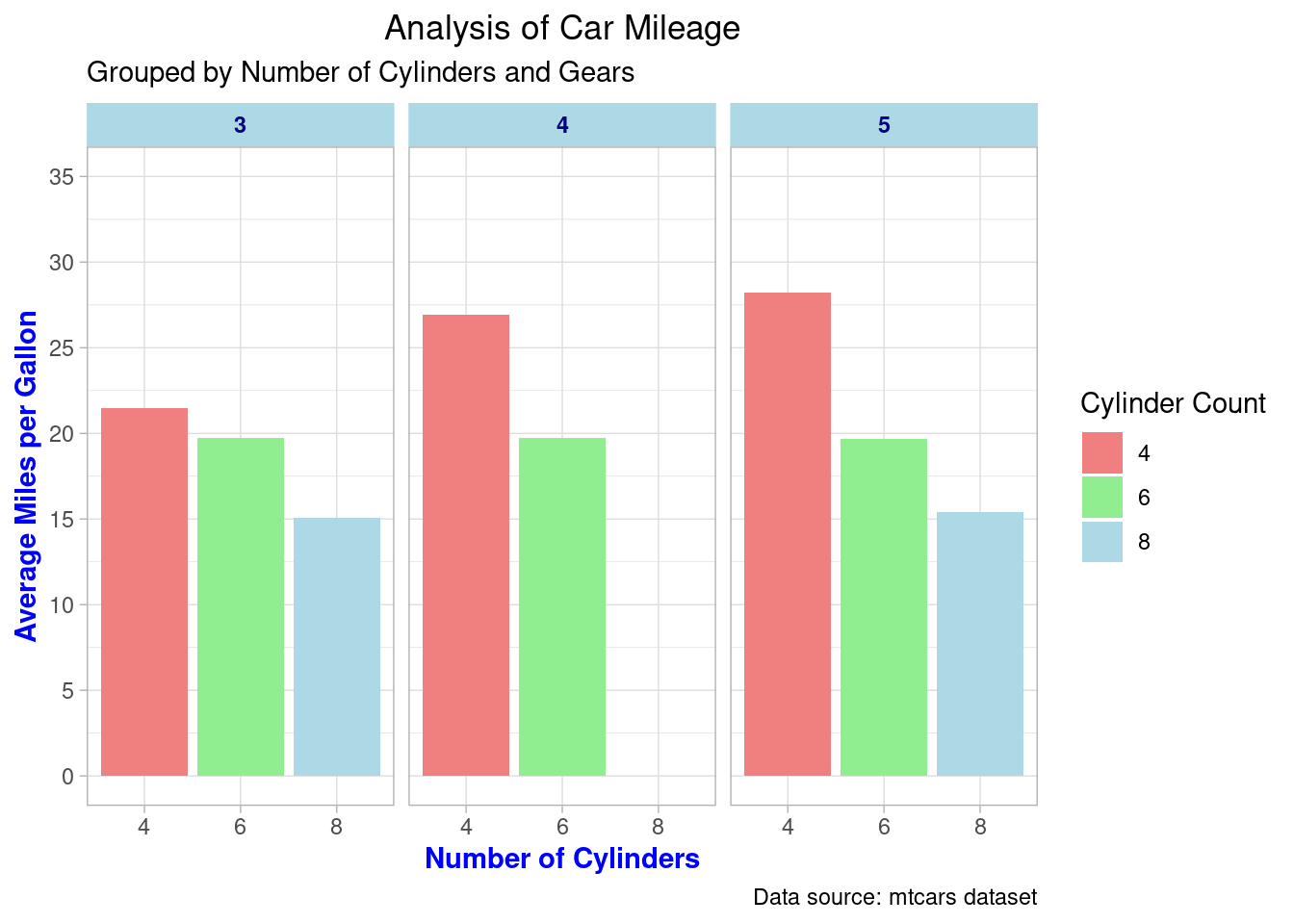
)
Properties:
Orientation: Bars are vertical.
Comparison: Easily compare different groups.
Axis: Categories on the x-axis, values on the y-axis.
Length: Bars’ length represents value.
library(ggplot2)

# Data
data(mtcars)
ggplot(mtcars, aes(x=factor(cyl), y=mpg, fill=factor(cyl))) +
  geom_bar(stat="identity", position="dodge", linewidth=0.25,width = 0.5) +
  scale_fill_brewer(palette="Set1") +
  labs(title="Average MPG by Number of Cylinders",
       x="Number of Cylinders",
       y="Average Miles Per Gallon (MPG)",
       fill="Cylinders") +
  theme_minimal(base_size = 14) +
  theme(legend.position="top",
        plot.title = element_text(hjust = 0.5),
        axis.text.x = element_text(angle = 45, hjust = 1))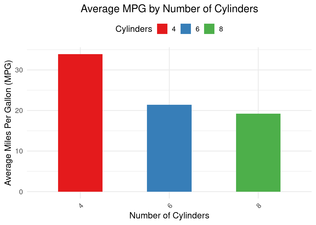
Properties:
Orientation: Bars are oriented horizontally instead of vertically.
Comparison: Facilitates comparison of values across categories, especially when category names are long.
Axis: The y-axis typically represents categories, while the x-axis represents values.
Length of Bars: Corresponds to the values they represent, allowing for direct comparison of different categories.
ggplot(mtcars, aes(x=factor(cyl), y=mpg, fill=factor(cyl))) +
  geom_bar(stat="identity", position="dodge",width = 0.5) +
  coord_flip() +
  scale_fill_brewer(palette="Set1") +
  labs(title="Miles Per Gallon by Cylinder Count",
       x="Number of Cylinders",
       y="Miles Per Gallon",
       fill="Cylinders") +
  theme_minimal() +
  theme(axis.text.x = element_text(angle = 45, hjust = 1),
        legend.position="top")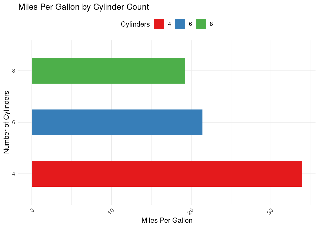
Properties:
Segmentation: Each bar is divided into segments that represent different sub-categories.
Total Comparison: Allows for the comparison of total amounts across categories.
Sub-category Analysis: Facilitates comparison within categories based on the segments.
Axis: Typically, one axis represents the categories, and the other axis represents a cumulative total value.
ggplot(mtcars, aes(x=factor(cyl), y=mpg, fill=factor(gear))) +
  geom_bar(stat="identity", position="stack") +
  scale_fill_brewer(palette="Set2") +
  labs(title="Stacked Bar Graph of MPG by Cylinder and Gear Type",
       x="Cylinder Count",
       y="Total Miles Per Gallon") +
  theme_minimal() +
  theme(legend.position="right")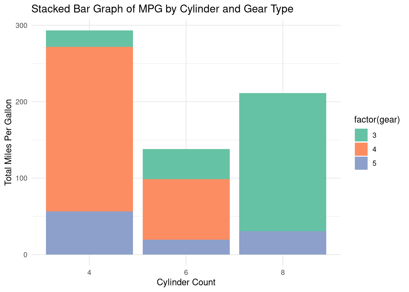
Properties:
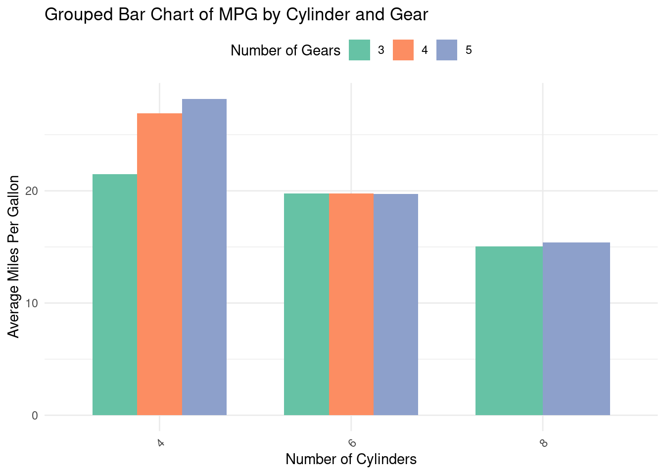
Distinct Groups: Categories are divided into subgroups, displayed side-by-side for comparison.
Axes: Typically, the x-axis shows the main categories, while the y-axis represents the measured value.
Colors/Fills: Different colors or patterns distinguish between subgroups within each main category.
Spacing: Bars within a group are placed close to each other but separated from other groups, aiding visual comparison between subgroups.
suppressPackageStartupMessages(library(dplyr))
library(ggplot2)
library(dplyr)

# Example dataset (you can replace mtcars with your own dataset)
data <- mtcars %>%
  group_by(cyl, gear) %>%
  summarise(mpg = mean(mpg), .groups = 'drop')

# Creating a grouped bar chart
ggplot(data, aes(x=factor(cyl), y=mpg, fill=factor(gear))) +
  geom_bar(stat="identity", position=position_dodge(), width=0.7) +
  scale_fill_brewer(palette="Set2") +
  labs(title="Grouped Bar Chart of MPG by Cylinder and Gear",
       x="Number of Cylinders",
       y="Average Miles Per Gallon",
       fill="Number of Gears") +
  theme_minimal() +
  theme(axis.text.x = element_text(angle=45, hjust=1),
        legend.position="top")