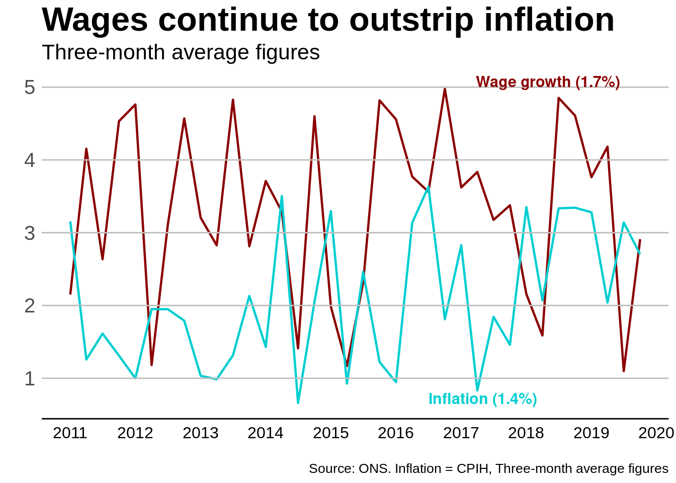
# Load the ggplot2 packagelibrary(ggplot2)# Load necessary librarylibrary(lubridate)# Set seed for reproducibilityset.seed(123)# Create a sequence of dates from 2011 to 2019 by quartersdates <-seq(as.Date("2011-01-01"), as.Date("2019-12-31"), by="quarter")# Generate random wage growth and inflation rateswage_growth <-runif(length(dates), min =1, max =5)inflation <-runif(length(dates), min =0.5, max =4)# Combine into a data framedata <-data.frame(date = dates, wage_growth = wage_growth, inflation = inflation)# Display the first few rows of the datahead(data)
# Assuming your data frame is named 'data' and it has columns 'date', 'wage_growth', and 'inflation'ggplot(data, aes(x=date)) +geom_line(size =0.8,aes(y=wage_growth, colour="Wage growth")) +geom_line(size =0.8,aes(y=inflation, colour="Inflation")) +#coord_cartesian(xlim = c(2011, 2020), ylim = c(1,5)) + scale_x_date(breaks =seq(as.Date("2011-01-01"), as.Date("2020-01-01"), by="1 year"),date_labels ="%Y")+# Correct approach for Date objects#scale_x_continuous(breaks = seq(2011, 2020, by = 1)) + # Add the scale layergeom_hline(yintercept =c(1, 2, 3,4 ,5 ), color ="grey", linewidth =0.5, linetype ="solid") +# Add horizontal linesscale_colour_manual(values=c("Wage growth"="darkred", "Inflation"="#00CED1")) +labs(title="Wages continue to outstrip inflation",subtitle="Three-month average figures",caption="Source: ONS. Inflation = CPIH, Three-month average figures",x="",y="")+annotate("text", x =as.Date("2019-01-01"), y =5, label ="Wage growth (1.7%)", colour ="darkred", hjust =0.8, vjust =0,fontface ="bold", family ="sans", size =4) +annotate("text", x =as.Date("2019-01-01"), y =0.8, label ="Inflation (1.4%)", colour ="#00CED1", hjust =1.5, vjust =1,fontface ="bold", family ="sans", size =4) +theme_minimal() +theme(text =element_text(family ="Arial", colour ="black"),plot.title =element_text(size =25, face ="bold"),plot.subtitle =element_text(size =16),plot.caption =element_text(size =10),axis.text.x =element_text(angle =0, vjust =0.5, size =12,colour ="black"),axis.text.y =element_text(size =15),axis.line.y =element_blank(),legend.position ="none",panel.grid.major =element_blank(),panel.grid.minor =element_blank(),panel.background =element_blank(),axis.line =element_line(colour ="black"))
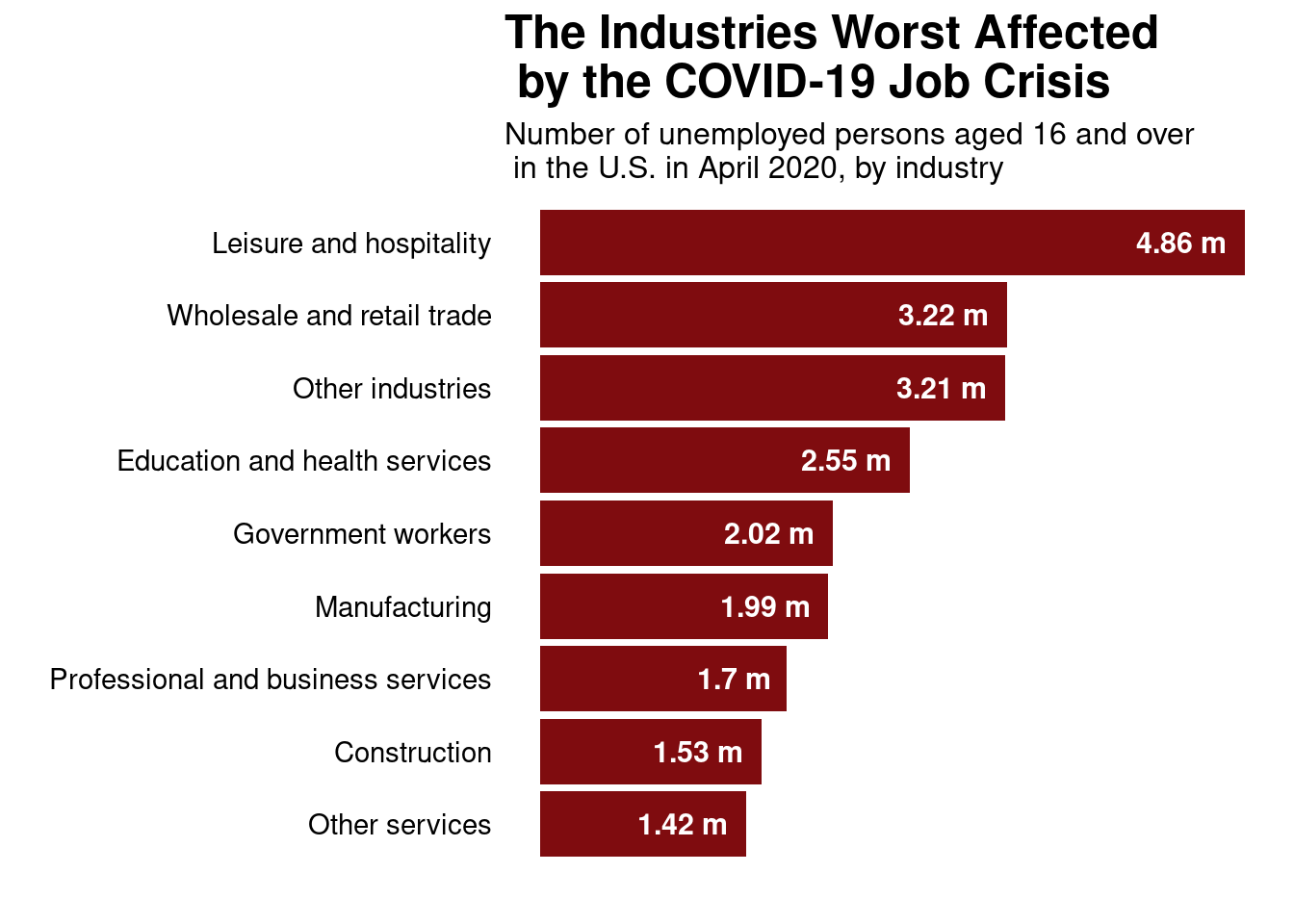
Bar Graph
# Load necessary librarylibrary(dplyr)# Create vectors for each columnindustries <-c("Leisure and hospitality", "Wholesale and retail trade","Education and health services", "Government workers","Manufacturing", "Professional and business services","Construction", "Other services", "Other industries")unemployed_numbers <-c(4.86, 3.22, 2.55, 2.02, 1.99, 1.70, 1.53, 1.42, 3.21) # in millionsunemployment_rates <-c(39, 17, 11, 9, 13, 10, 17, 23, 0) # in percentage, placeholder for 'Other industries'# Create a data framejob_crisis_data <-data.frame(Industry = industries,UnemployedNumbers = unemployed_numbers,UnemploymentRate = unemployment_rates)# Print the data frameprint(job_crisis_data)
                            Industry UnemployedNumbers UnemploymentRate
1            Leisure and hospitality              4.86               39
2         Wholesale and retail trade              3.22               17
3      Education and health services              2.55               11
4                 Government workers              2.02                9
5                      Manufacturing              1.99               13
6 Professional and business services              1.70               10
7                       Construction              1.53               17
8                     Other services              1.42               23
9                   Other industries              3.21                0
library(ggplot2)job_crisis_data$UnemployedNumbers <- job_crisis_data$UnemployedNumbers# Creating the plotggplot(data = job_crisis_data, aes(x =reorder(Industry, UnemployedNumbers), y = UnemployedNumbers)) +geom_bar(stat ="identity", fill ="#7f0c0f") +geom_text(aes(label =paste0(UnemployedNumbers, " m")), vjust =0.5, hjust =1.2,color ="white",fontface ='bold',size =4) +scale_y_continuous(labels = scales::comma, breaks = scales::pretty_breaks(n =10)) +theme_minimal() +labs(title ="The Industries Worst Affected\n by the COVID-19 Job Crisis",subtitle ="Number of unemployed persons aged 16 and over\n in the U.S. in April 2020, by industry",x ="",y ="") +theme(plot.title =element_text(size =18, face ="bold"),plot.subtitle =element_text(size =12),axis.text.x =element_blank(),axis.text.y =element_text(size =11,colour ="black"),panel.grid.major =element_blank(),panel.grid.minor =element_blank(),) +coord_flip() # Flip the coordinates to make a horizontal bar chart