library(ggplot2)

# Define the data layer
p <- ggplot(data = mtcars, aes(x = factor(cyl), y = mpg))
p-1.png)
Purpose : A box plot, also known as a box-and-whisker plot, is a standardized way of displaying the distribution of data based on a five-number summary: minimum, first quartile (Q1), median, third quartile (Q3), and maximum. It is a graphical rendition of statistical data based on the minimum, first quartile, median, third quartile, and maximum.
The Box: The central box of the box plot represents the interquartile range (IQR), which is the range between the first quartile (Q1, the 25th percentile) and the third quartile (Q3, the 75th percentile). This box contains the middle 50% of the data. The length of the box, therefore, gives a visual representation of the data’s spread.
The Median: Inside the box, a line (often called the median line) indicates the median (the 50th percentile) of the data set. The position of the median line within the box can give a visual indication of the data’s skewness; if the line is closer to the top or bottom, the data are skewed up or down, respectively.
Whiskers: Lines (or “whiskers”) extend from the top and bottom of the box to the maximum and minimum values within the data set, typically within 1.5 times the interquartile range from the upper and lower quartiles. The whiskers provide a visual indication of the variability outside the upper and lower quartiles, offering a sense of the data’s spread beyond the middle 50%.
Outliers: Data points that fall outside the whiskers are often plotted individually as small dots, circles, or stars. These represent outliers - values that are unusually high or low compared to the rest of the data set. Outliers are typically defined as observations that fall more than 1.5 IQRs below the first quartile or above the third quartile.
Start by specifying your dataset and aesthetic mappings. Here, you choose which variable will be on the x-axis (typically a categorical variable) and which will be on the y-axis (typically a continuous variable).
library(ggplot2)
# Define the data layer
p <- ggplot(data = mtcars, aes(x = factor(cyl), y = mpg))
p
Next, add the geometric object corresponding to the box plot:
# Add the geometric layer
p <- p + geom_boxplot(width = 0.5,fill = "lightgreen", color = "darkblue", outlier.color = "red", outlier.shape = 1)
p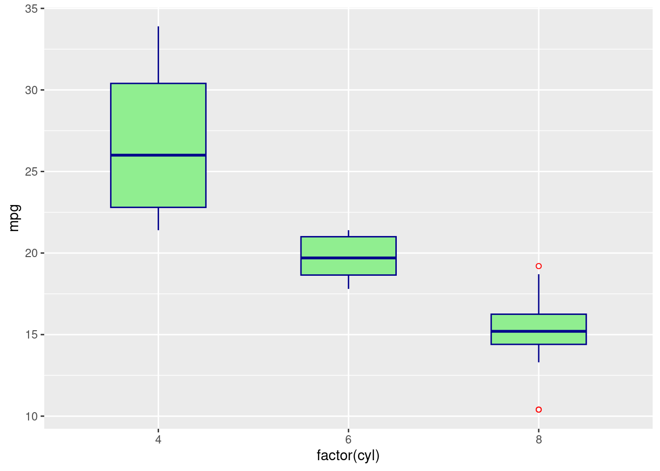
Customize the scales to improve readability and appearance:
# Add the scale layer
p <- p + scale_x_discrete(name = "Number of Cylinders") +
        scale_y_continuous(name = "Miles per Gallon")
p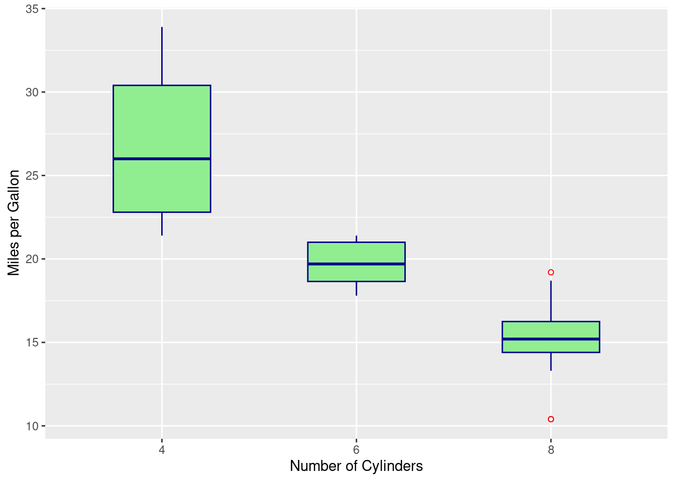
For box plots, the default Cartesian coordinate system is typically appropriate, but you can adjust if necessary:
# Optional: Add coordinate system adjustments if needed
# p <- p + coord_flip() # Use if you prefer horizontal boxesMake your box plot clean and visually appealing by choosing a minimal theme and customizing other non-data elements:
# Add the theme layer for aesthetics
p <- p + theme_minimal() +
        theme(axis.title = element_text(face = "bold"),
              axis.text = element_text(color = "darkgray"),
              plot.title = element_text(hjust = 0.5, size = 20),
              panel.background = element_rect(fill = "lightyellow"))
p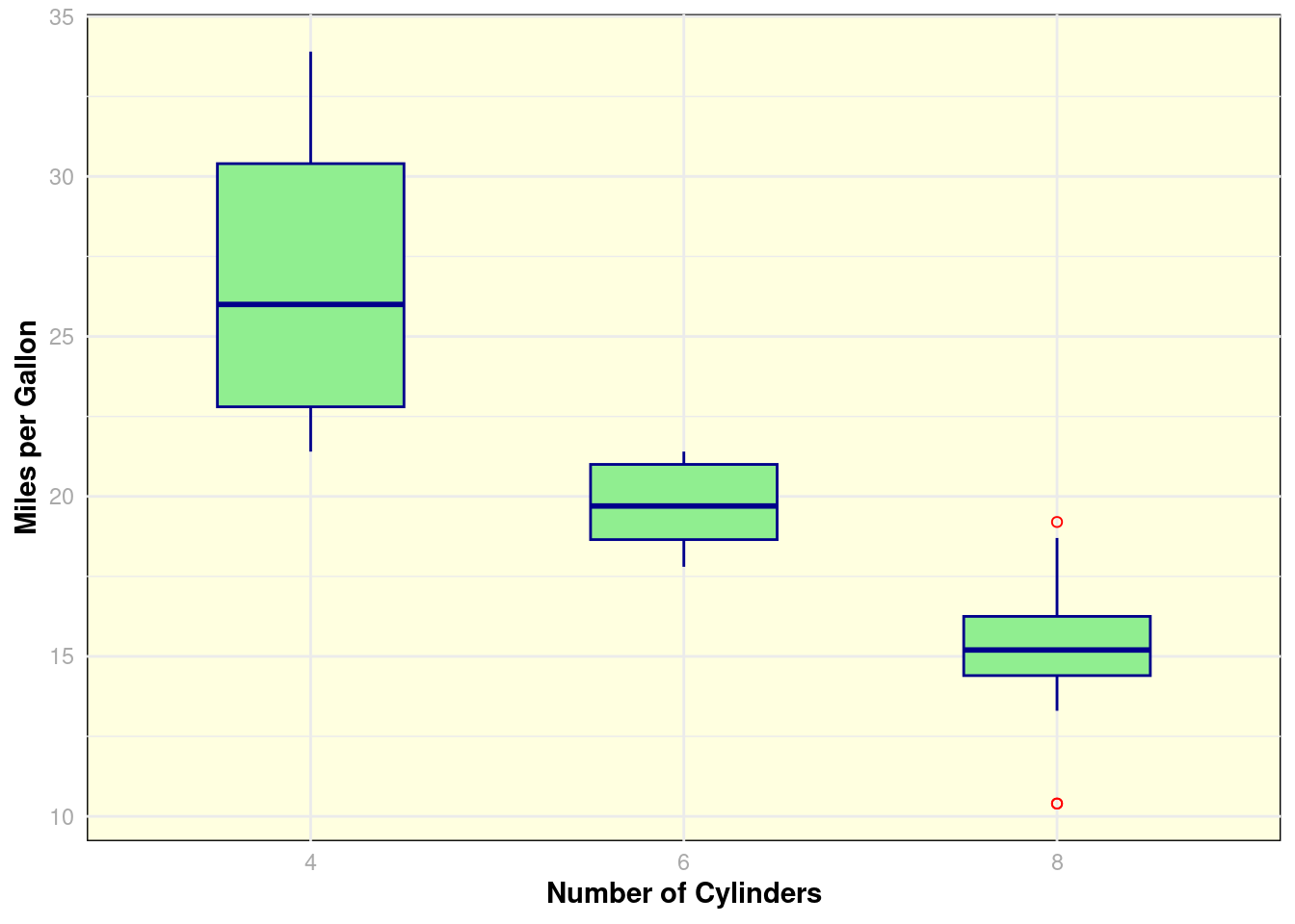
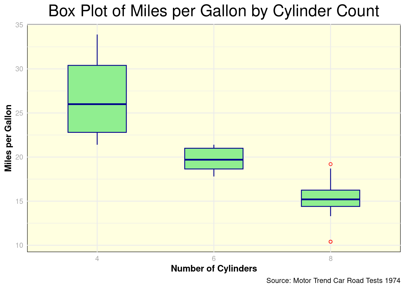
Finally, add informative labels and a title to your plot:
# Add labels
p <- p + labs(
  title = "Box Plot of Miles per Gallon by Cylinder Count",
  caption = "Source: Motor Trend Car Road Tests 1974"
)
p