Properties of Grammar of Graphics
Data:
The raw material of the visualization. It consists of observations (rows) and variables (columns) that we want to explore.
- In the context of ggplot2 and the Grammar of Graphics, data is typically a dataframe where each column is a variable and each row is an observation.
- This dataset forms the foundational layer upon which all subsequent aesthetic mappings, geometries, and statistical transformations are applied to create a visualization.
- The Grammar of Graphics can visualize a wide range of data types including quantitative, categorical, and date/time data. This encompasses simple datasets like heights and weights, complex information such as financial time series, geographical data like maps, and multidimensional data through faceting and aesthetics. Essentially, any data that can be structured into observations (rows) and attributes (columns) can be visualized using the principles of the Grammar of Graphics.
- R can visualize image and audio data, but not in the same direct way as standard data plots. For images, R can display them, perform operations, and analyze features with packages like imager or magick. For audio, R can visualize waveforms, spectrograms, or other features using packages like seewave or tuneR. These require specific data formats and are more about analysis and feature extraction rather than conventional plotting guided by the Grammar of Graphics.
Geometries (Geoms):
The geometric shapes that represent data points on the plot, such as bars, lines, points, etc. Different geoms are suitable for different types of data and analysis. Here’s a concise list of some common geoms in ggplot2:
- geom_point(): Scatter plots.
- geom_line(): Line charts.
- geom_bar(): Bar charts.
- geom_histogram(): Histograms.
- geom_boxplot(): Box plots.
- geom_area(): Area charts.
- geom_density(): Density plots.
- geom_violin(): Violin plots.
- geom_tile(): Heatmaps.
- geom_text(): Text labels.
- geom_smooth(): Adds a smoothed conditional mean.
- geom_rug(): Adds marginal rug plots.
- geom_contour(): Contour plots for three-dimensional data.
- geom_jitter(): Adds jittered points for better visualization of overlaps.
- geom_errorbar(): Adds error bars.
- geom_polygon(): Draws polygons, useful for maps.
- geom_path(): Draws lines between data points in order.
- geom_step(): Creates stepwise line plots.
- geom_qq(): Produces a QQ plot.
- geom_spoke(): Creates spoke diagrams, useful for directional data.
Aesthetics (Aes):
Attributes of the geoms, such as color, size, shape, and x-y positioning, which can be mapped to variables in the data to visually encode information.Common aesthetic mappings include:
- x: Position on the x-axis.
- y: Position on the y-axis.
- color or colour: Color of lines and points.
- fill: Color filling an area.
- size: Size of points or width of lines.
- shape: Shape of points.
- linetype: Type of lines.
- alpha: Transparency of objects.
- group: Grouping variable for lines or other geoms.
- weight: Weight of each point.
- height: Height for density/area plots.
- width: Width for certain elements.
- angle: Text angle.
- family, fontface, hjust, vjust: Text formatting options.
Scales:
Functions that map the values of variables to aesthetics. They help in translating data into visual properties like size, color, or position. Scales can be linear, logarithmic, categorical, etc., and they define how data values are translated into visual properties.
- scale_x_continuous/scale_y_continuous: Map continuous values to x or y axes.
- scale_x_discrete/scale_y_discrete: Map discrete values to x or y axes.
- scale_color_manual/scale_fill_manual: Define custom colors for discrete variables.
- scale_color_gradient/scale_fill_gradient: Create color gradients for continuous variables.
- scale_size: Map numeric values to sizes.
- scale_shape: Define shapes for different categories.
- scale_linetype: Set line types for different categories.
Statistical Transfor(Stats):
Statistical summaries or transformations of the data that can be visualized, such as counting, binning, averaging, or fitting models. These transformations aggregate or modify the data before it is visualized.
- stat_summary(): Summarizes y values for each unique x.
- stat_bin(): Bins data and counts frequencies, used in histograms.
- stat_boxplot(): Computes box-and-whisker plot components.
- stat_smooth(): Adds a smoothed conditional mean.
- stat_function(): Computes a function for all x values.
- stat_density(): Computes kernel density estimates.
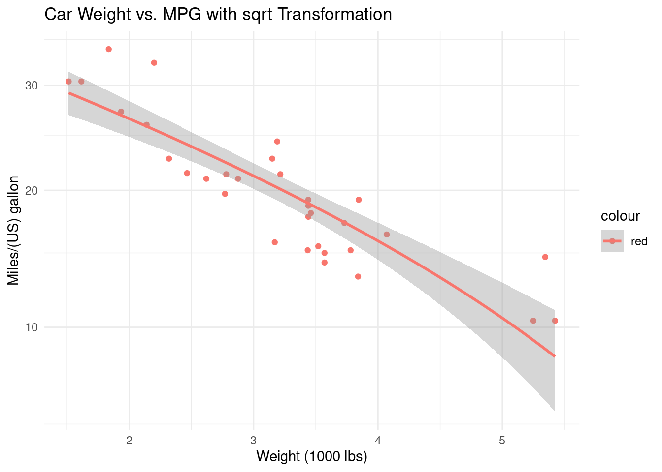
Coordinate Systems:
The space in which the data is plotted. While Cartesian coordinates are the most common, other systems like polar coordinates can be used for specific types of visualizations.Some properties include:
- coord_cartesian(): Default Cartesian coordinate system.
- coord_fixed(): Cartesian system with fixed aspect ratio.
- coord_flip(): Flips the x and y axes for horizontal plots.
- coord_polar(): Transforms to polar coordinates, useful for pie charts or wind rose diagrams.
- coord_trans(): Applies transformations to scales, like logarithmic or sqrt.
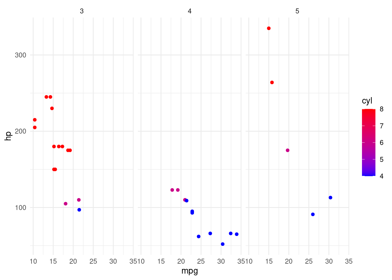
Facets:
The aspect of the Grammar of Graphics that allows for splitting data into subsets and displaying them as small multiples (individual plots) within the same graphic. This enables comparison across different categories or levels.
- facet_wrap(): Creates a strip of plots for one categorical variable, wrapping them into a specified number of rows or columns.
- facet_grid(): Organizes plots into a grid based on two categorical variables, one for rows and one for columns.
Themes:
Non-data ink modifications to the plot, including background, gridlines, and text, used to enhance the readability or aesthetic appeal of the plot.Some functions include:
theme(): Customizes specific elements of a plot’s theme.
theme_get(): Returns the current theme.
theme_set(): Sets the current theme for all plots.
theme_update(): Updates elements of the current theme.
theme_replace(): Replaces the current theme.
Layers:
Multiple data representations overlaid on the same set of axes, allowing for the combination of multiple geoms and stats in the same visualization.Properties of Layer in R:
- geom_: Defines the type of geometric object (e.g., geom_point(), geom_line()).
- stat_: Specifies statistical transformation (e.g., stat_smooth(), stat_summary()).
- data: Datasets specific to each layer.
- aes(): Aesthetic mappings within the layer.
- position: Position adjustments for overlapping elements (e.g., position_dodge(), position_jitter()).