library(ggplot2)

# Define the data layer
p <- ggplot(data = mtcars, aes(x = wt, y = mpg))
p-1.png)
Used to display changes or trends over time. They are particularly effective for showing the relationship between two continuous variables.
Define the dataset you are going to use and map your aesthetics—this includes specifying which variables will be plotted on the x and y axes.
library(ggplot2)
# Define the data layer
p <- ggplot(data = mtcars, aes(x = wt, y = mpg))
p
Add the geometric object that represents the type of plot you want to create. For line graphs, this is geom_line().
# Add the geometric layer
p <- p + geom_line(color = "darkred")
p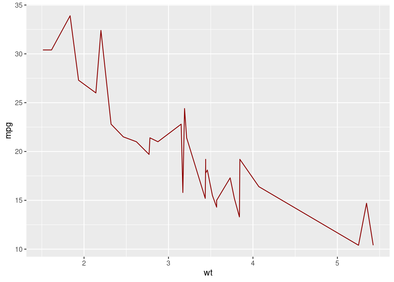
For line graphs, this might not always be applicable unless you’re smoothing data. However, for completeness:
# Add a statistical transformation layer for smoothing
p <- p + stat_smooth(method = "lm",aes(color = "Regression Line"), se = TRUE, linewidth = 1)
p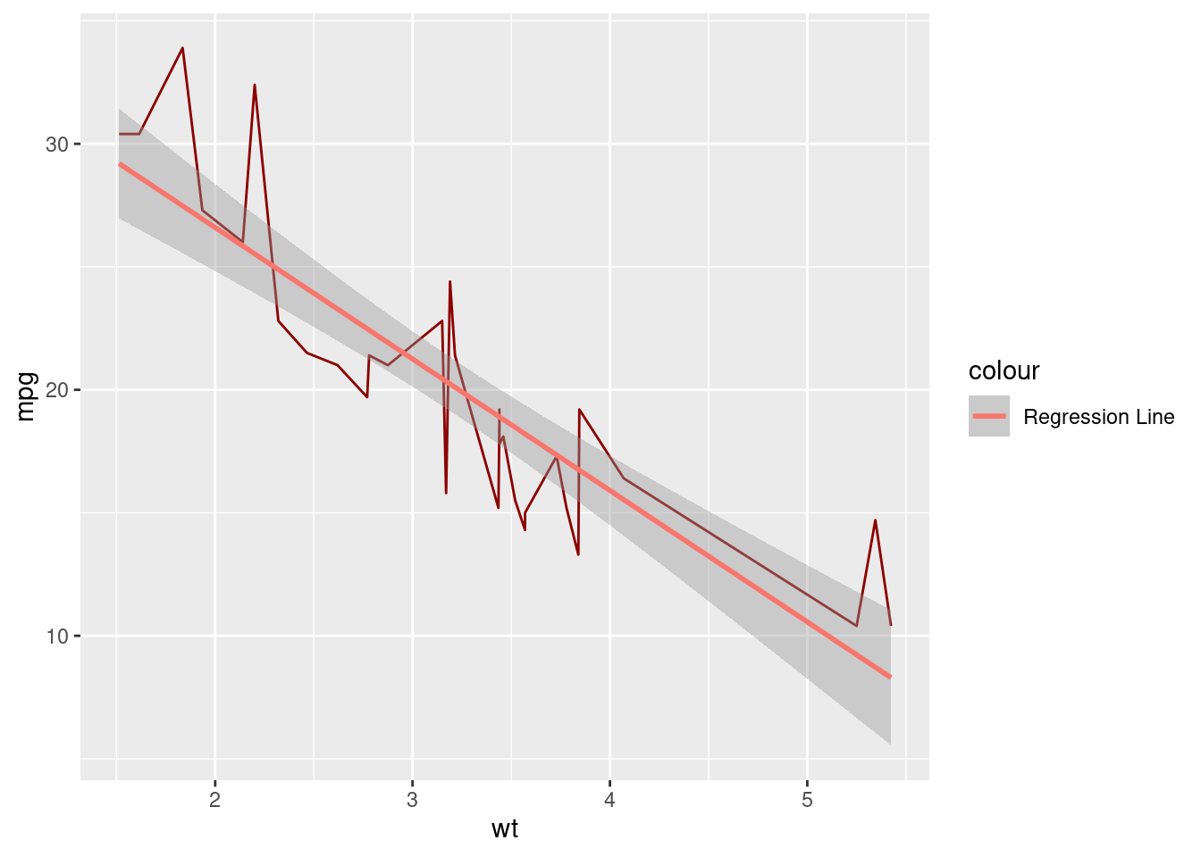
The scale layer controls how data values are converted into visual properties. You can customize scales for each aesthetic (e.g., x, y).
# Add the scale layer
p <- p + scale_x_continuous(name = "Car Weight")
p <- p + scale_y_continuous(name = "Fuel Efficiency (MPG)")
p <- p + scale_color_manual(values = "green", labels = "Linear Model") # Assign color to the regression line

p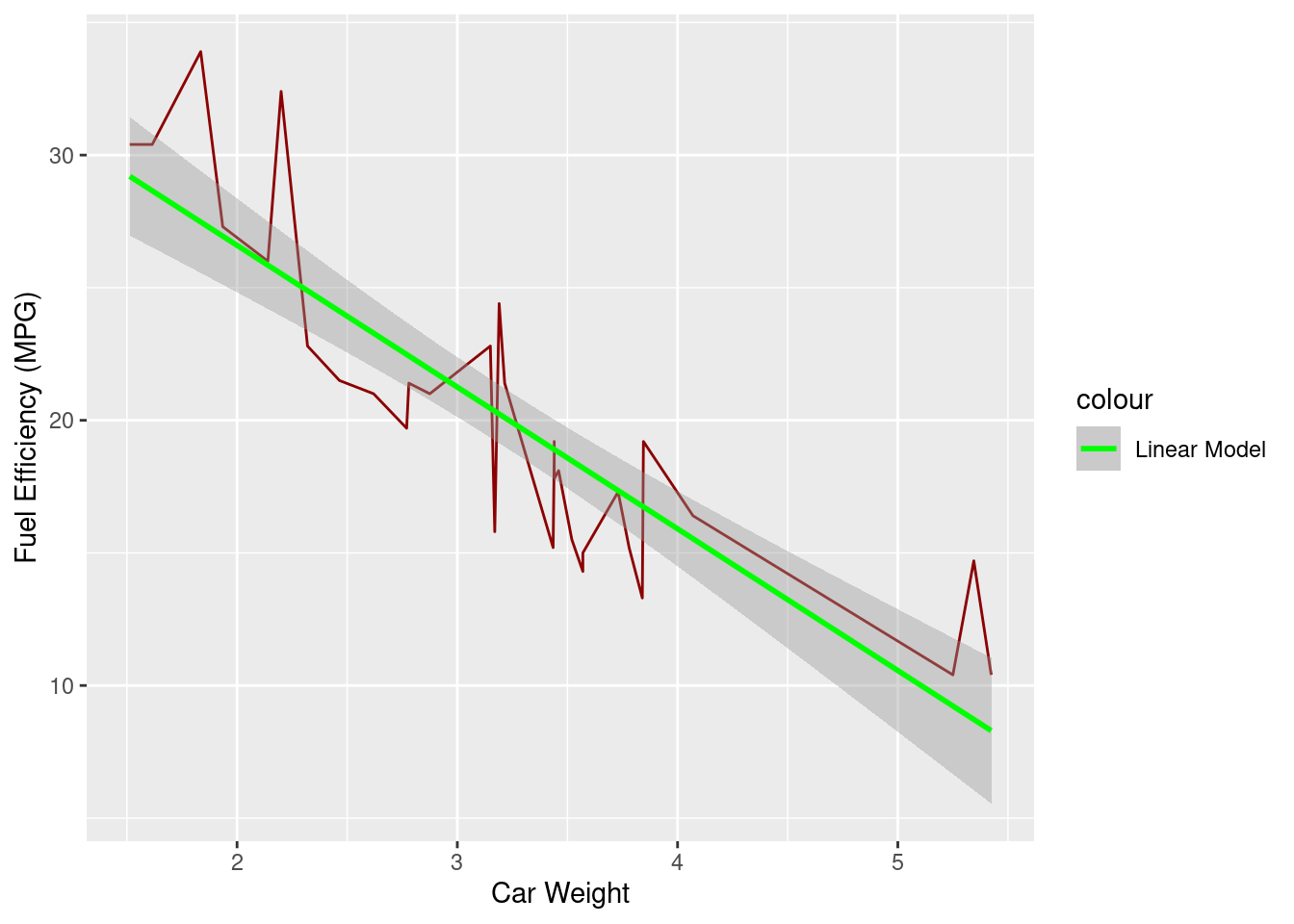
While the default is Cartesian coordinates, you can adjust this if needed. For line graphs, typically, the default is sufficient. If you want to flip coordinates you can use coord_flip().
#Add coordinate system adjustments
# p <- p + coord_cartesian(xlim = c(a, b), ylim = c(c, d))
# p <- p + coord_flip()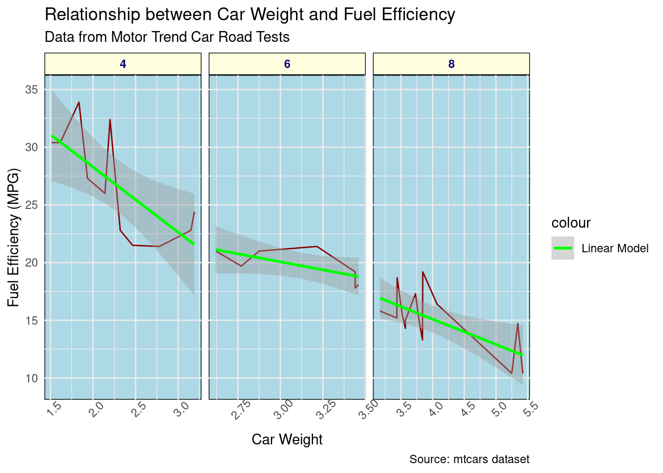
# pIf you wish to create multiple line graphs based on another variable (say, by the number of cylinders), you can add facets.
# Add facet layer
p <- p + facet_wrap(~cyl,scales = "free_x")
p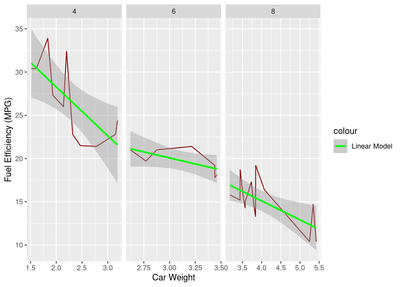
Finally, you can customize the non-data appearance of your plot using themes.
# Add the theme layer
p <- p + theme_minimal()
p <- p + theme(axis.text.x = element_text(angle = 45),
        strip.background = element_rect(fill = "lightyellow"),
        strip.text = element_text(face = "bold", color = "navy"),
        panel.background = element_rect(fill = "lightblue"))
p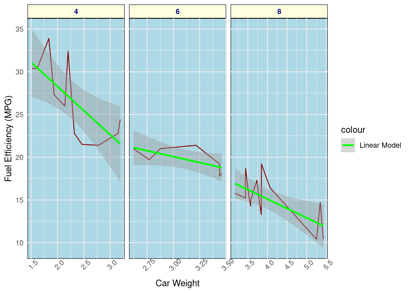
Add titles, subtitles, captions, and axis labels.
# Add labels
p <- p + labs(
  title = "Relationship between Car Weight and Fuel Efficiency",
  subtitle = "Data from Motor Trend Car Road Tests",
  x = "Weight (1000 lbs)",
  y = "Miles per Gallon",
  caption = "Source: mtcars dataset"
)
p